A refreshed logo for the IHF
12 Jul. 2020
To celebrate the start of the inaugural ‘International Handball Week’, the International Handball Federation (IHF) is proud to unveil a refreshed and updated logo.
In order to stay relevant in the global sporting market and to appeal to a modern audience, the previous IHF logo has been modernised with a sleek, minimalist look suitable for, and responsive to, the digital age.
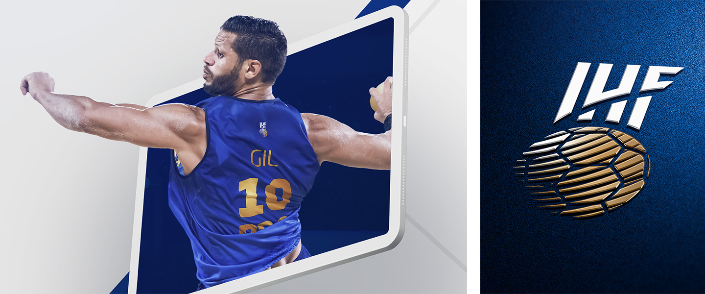
Like the IHF itself, the logo features handball at its core. A full shaded ball comes to life with its white lines marked in negative with the circular element not only symbolising the sport, but a globe, acknowledging the role the IHF has as its global governing body.
Across the ball, dynamic, curved lines signify the movement of the sport both as a dynamic sport in itself and with the responsibility of the IHF to move the sport forward continually, growing it globally.

The ‘IHF’ lettering has risen from the previous logo, with enlarged vertical form letters placed over the handball/globe, symbolising the IHF’s role as a one federation uniting and caring for all its Member Federations and Confederations, all of whom are joined together through their love of the sport, shared ideals and common purpose.
Finishing off the design elements are the colours. While the IHF lettering continues in the traditional contrast of blue and white, refreshed for a modern palette, the ball, globe and movement are in gold, signifying the historic prestige and the IHF’s rich traditions.
Altogether, the colour adaptations allow the IHF more flexibility with their identity in the future and will help to make use of more modern design needs and requests.
In addition to the new, refreshed logo, which will be gradually implemented everywhere over the next few weeks, the IHF will launch an expanded branding package and identity, covering all IHF events, activities and resources, later this year.